Doing
Things
An internet brand grows up. Kind of.
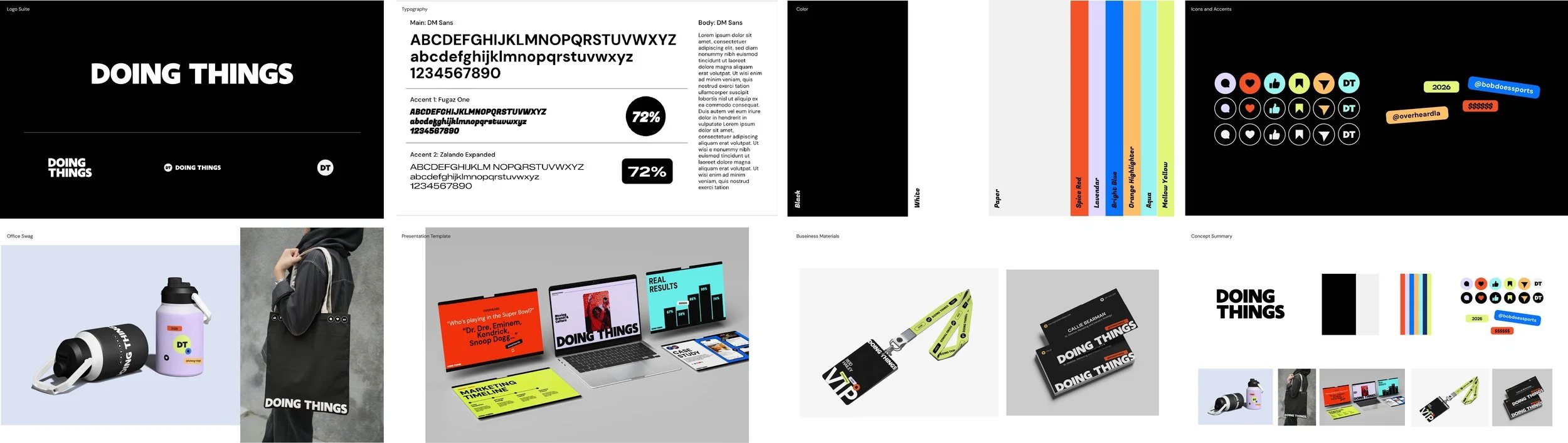
The BriefThe rebrand wasn't about finding a new personality. It was about building a visual system worthy of the scale they'd already achieved.
The ask: grow up (not too much), without losing the thing that makes Doing Things Doing Things: the speed, the irreverence, the joy. That didn't need to be fixed—they're pros at it. But the team needed something that could live as a foundation to the portfolio, and importantly, be usable to the internal team on a variety of pitch and marketing materials.
The ApproachWe called the direction Choreographed Chaos: discipline at the center and left room for spontaneity at the edges. Smart scaffolding, not a competing personality.
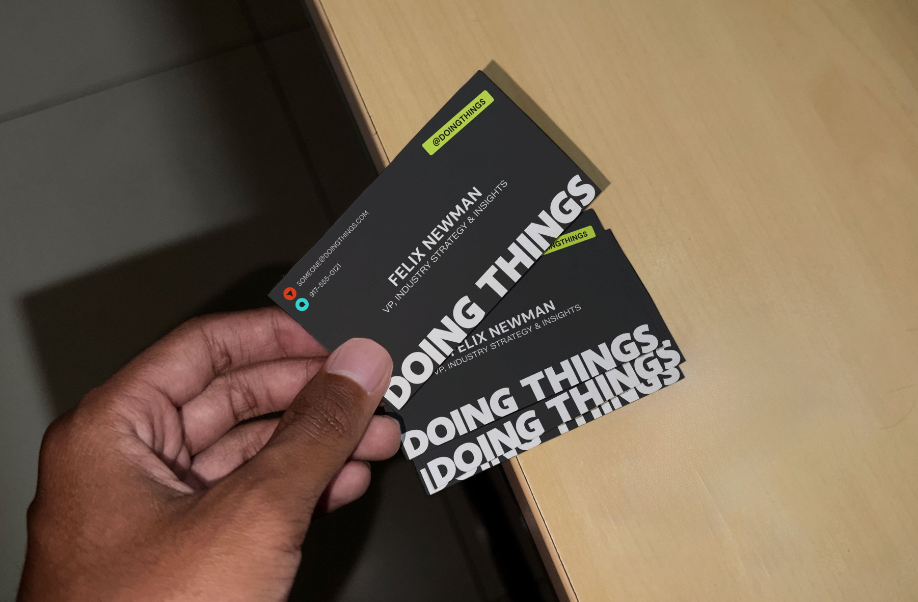
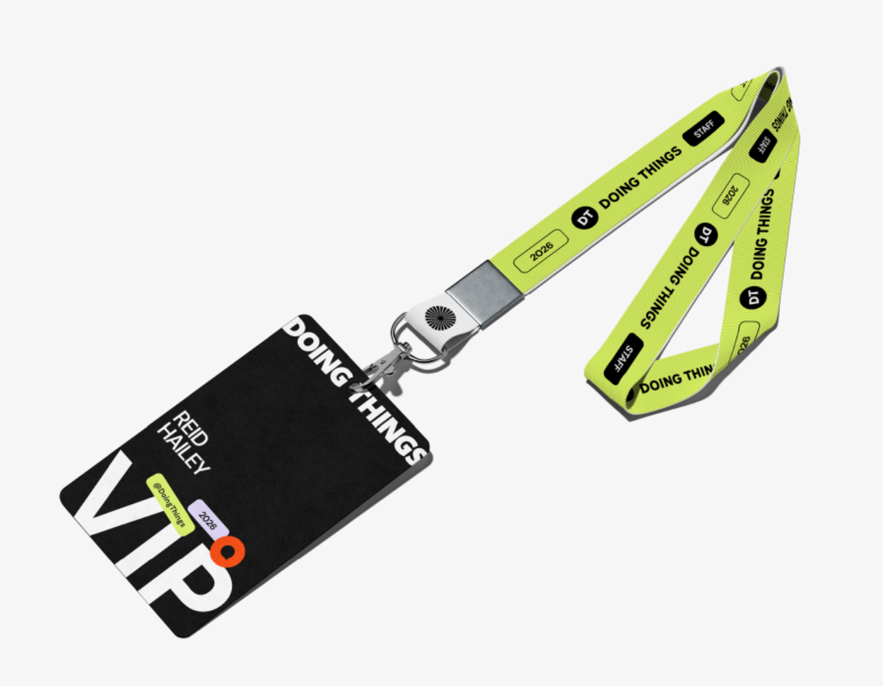
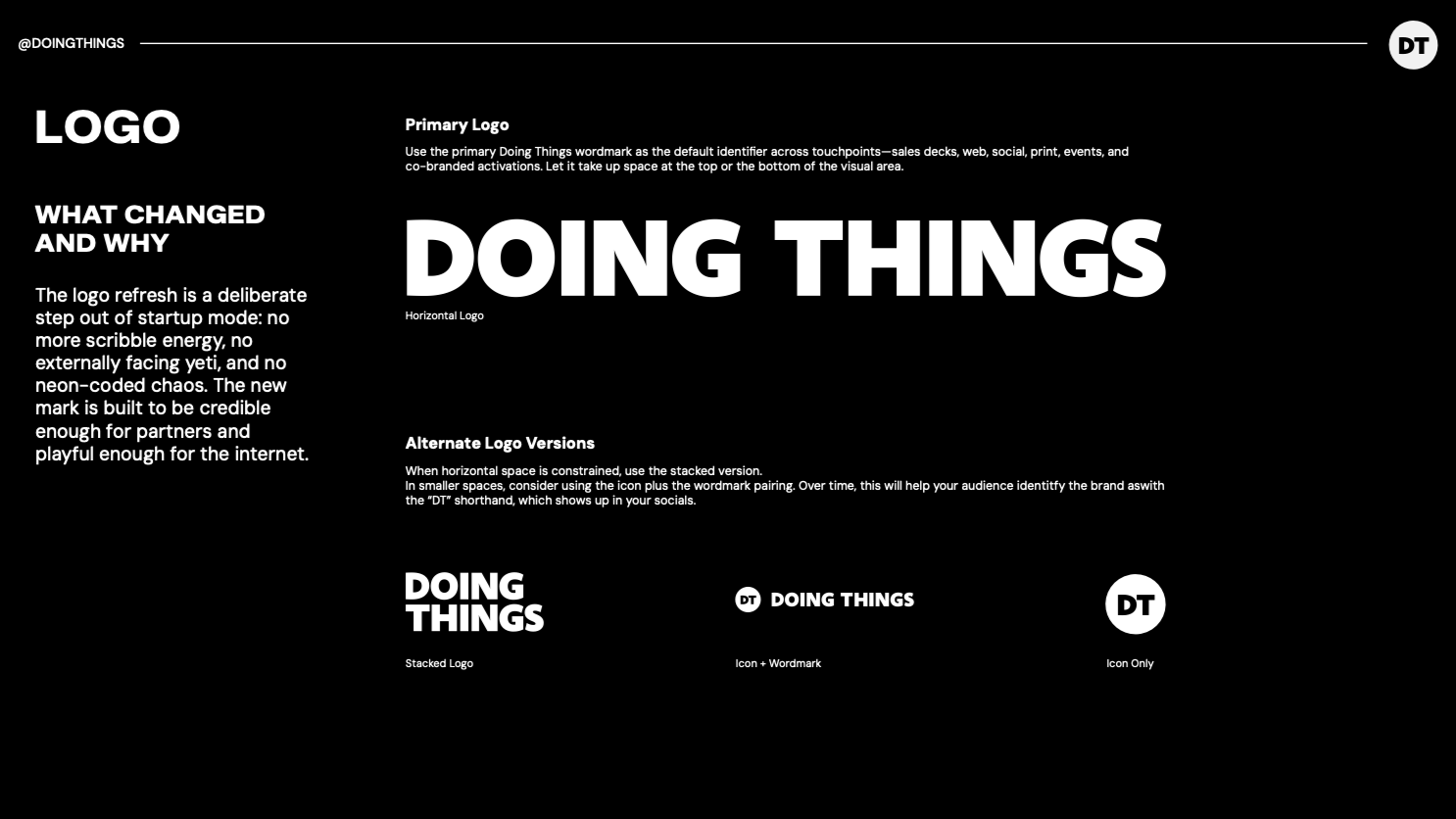
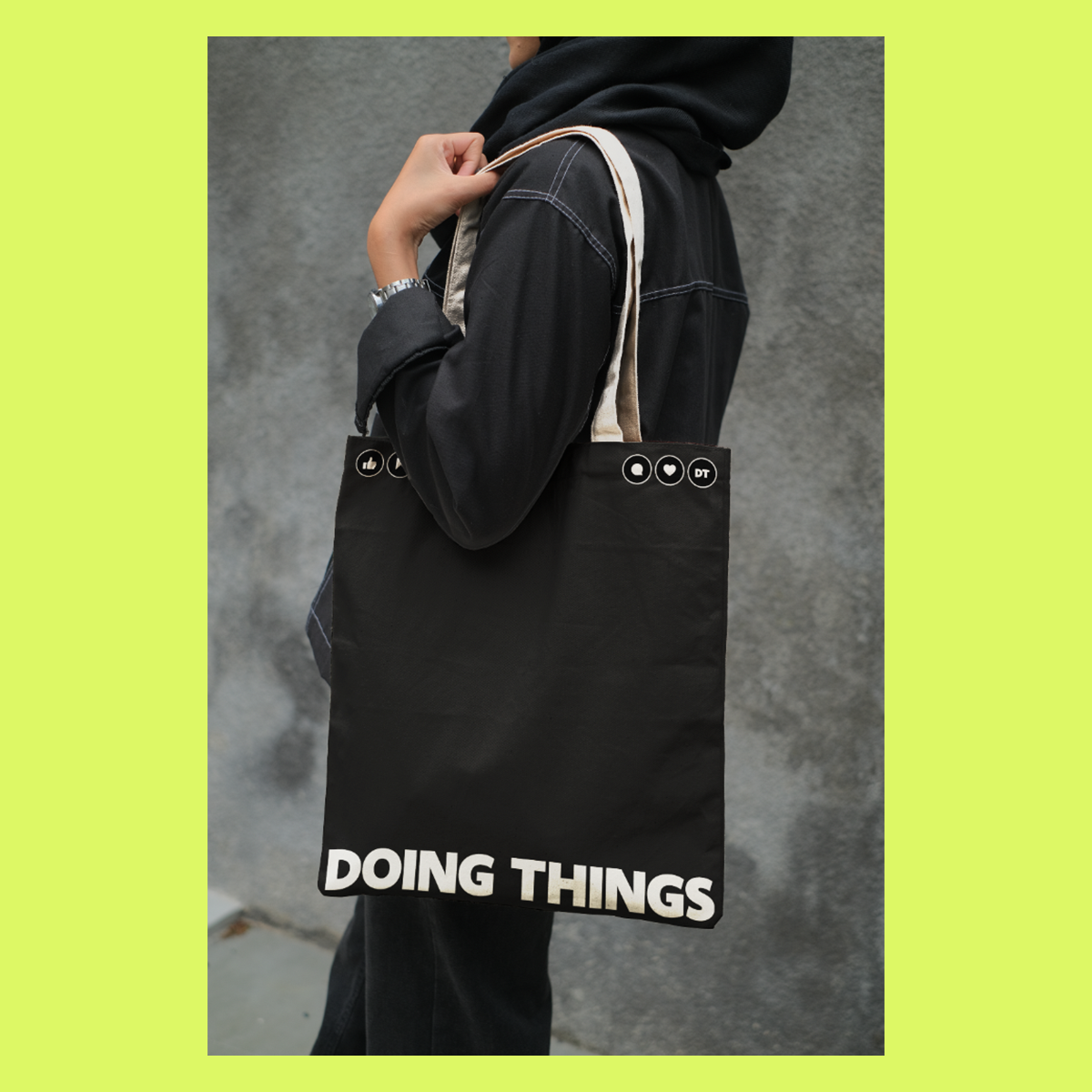
Declarative wordmark. The black-dominant palette anchors a grownup in the room, with accent colors that land like a highlight reel. An icon system that adds personality without noise. A presentation architecture the sales team could use. The logo only comes in black and white. The system brings the color.